I do love working in Markdown.
I find it gets me out of “edit mode” and into “create mode” a lot easier. No distracting formatting to obsess over, and just lots of clean text to work on. And I can edit it with anything.
In fact, I love it so much, I moved this blog to Hexo last year to give myself an experience of writing it in more seriously. And it’s been a great experience. Everything is just text!
I’ve just finished Wes Bos great (and free) course on Mastering Markdown - and I learned a whole bunch of new Markdown hacks and thought I’d share a few that were new to me.

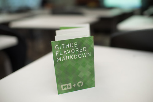
flickr photo shared by othree under a Creative Commons ( BY ) license
Links Redux
I’ve definitely been doing linking harder, not smarter. I’ve been using the common version of Markdown linking that everyone knows and loves:
I'm loving the [Mastering Markdown](http://masteringmarkdown.com/) course.
Which is fine, but adds a lot of visual clutter, and isn’t very DRY. In the course I learned that you can use literals instead of links, then dereference them later. Which is awesome in reducing visual clutter AND making your links easier to update.
So now I’ve switched to this style to simplifying my world even more:
I'm loving the [Mastering Markdown][mm] course.

[mm]: http://masteringmarkdown.com/
I also didn’t realise you can supply title elements on links so that when you hover over the link, you get the tooltip:
[mm]: http://masteringmarkdown.com/ "Mastering Markdown by Wes Bos"
Cute!
Say it with me, “Underscore for italics, Double aster for bold”
You can use the standard *single aster* for italics, and a **double aster* for bold, but those things look really similar in source form.
And remember we’re hacking on really clean and clutter free Markdown source.
So I’m moving to Wes’ recommendation to just us _underscore_ for italics, so you know that asters are always bold.
Good tip!
Image Placeholders
Ok, this next one strictly speaking isn’t a Markdown tip, but the course used UnsplashIt to generate Image placeholders.
Markdown doesn’t support image sizes natively (but you can always fall back to raw <img> tags). However, if you’re hacking a blog post and know you’ll be inserting an image later, and you know the dimensions, then UnsplashIt is the site you’re looking for.
Put in something like:

And you’ll have yourself a nice random 640x480 random image to play with. Of course you can also combine that with the last tip to have a handy literal for your placeholder images. How about:
 ![My Stock 640x480 Image][640x480]

 [640x480]: https://unsplash.it/640/480?random "640x480 placeholder"
Embed source code with tabs rather than backticks
I’m used to using a triple backtick for embedded source, but you can, of course, just use a plain tab indent
var src = 'just use a tab';
console.log("So much less noise when you " + src);
That’s not going to work if you have specific syntax highlighting you need to force your Markdown compiler into, but for a lot of common cases, it’s another step towards less visual clutter.
Headings as —- and ====
Although we all prefer using hash (#) for headings (not least of which because it opens up many more heading levels), I didn’t know that you can use the minus and equals signs for heading levels.
You only have access to h1 and h2, but it does keep the document looking very plaintext!
Level One Heading
=================

Level Two Heading
-----------------
I think this would be a cool hack for README files that you expect to be mostly read outside of a Markdown rendering context.
And there were tons more…
But that’s a few hacks to get you started on your “cleaner Markdown” journey.
But don’t take my work for it, head on over to Mastering Markdown and pick up a few of your own!
Happy Markdown-ing!
